The Investment Thread
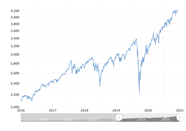
I guess the only counter to this is that the post-COVID bounce back looks a little too sharp. People/tutes taking advantage of the recovery plays and inflating them prematurely perhaps?
I guess the only counter to this is that the post-COVID bounce back looks a little too sharp. People/tutes taking advantage of the recovery plays and inflating them prematurely perhaps?
