Restaurant Menus

Look out for these in particular…
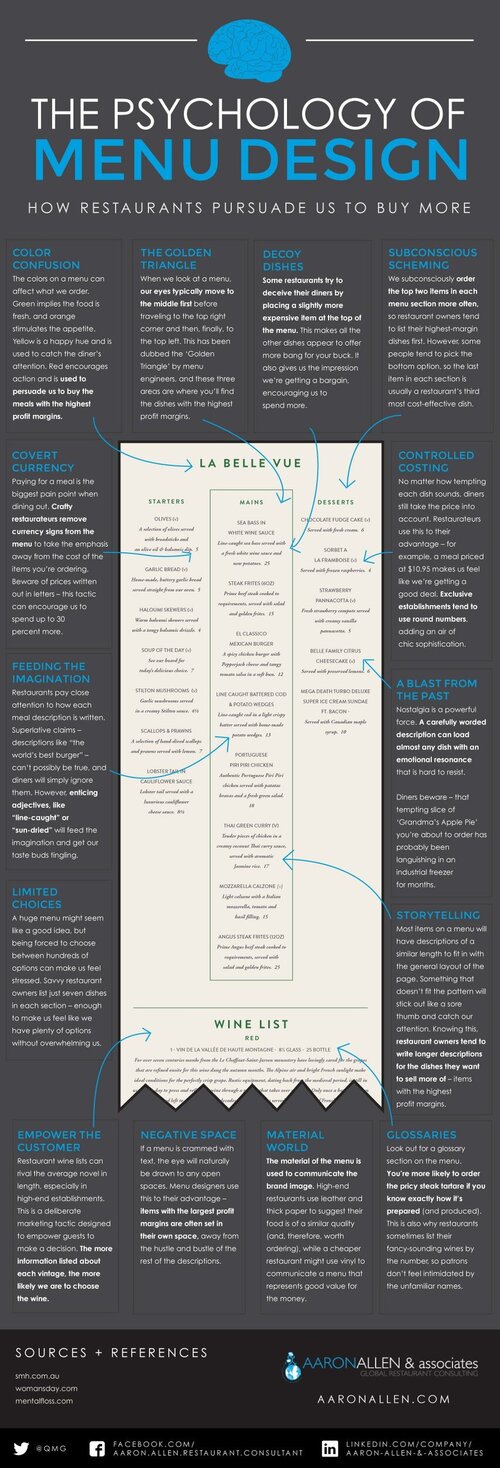
The Golden Triangle
When we open a menu, our eyes focus on the middle of the page, before glancing at the top right corner, and then the top left – try it! This is known as the ‘Golden Triangle’ to menu engineers, who position the most expensive options in these spots. Tactical.
Colour confusion
Certain colours help conjure feelings and motivate behaviour. Green implies the food is fresh, and orange stimulates the appetite. Meanwhile, yellow is used to catch the diner’s attention and, since red encourages action, it’s used to highlight meals with the highest profit margins.
Negative space
The eye is naturally drawn to open spaces. So, you can guess what menu designers do…they place items with the largest profit margins in them. Probably written in red.
A blast from the past
We all have that one meal that takes us back to childhood. Restaurants know this tendency, and use it to their advantage. That tempting slice of ‘Grandma’s Apple Pie’ has probably been languishing in an industrial freezer for months, just like all of the other desserts.
Controlled costing
No matter how tempting each dish is, diners always take cost into account. Restaurateurs often remove pound signs completely because they remind people they’re spending money.
Number combinations also have different connotations: prices ending in 99 suggest value, while those ending in 95 suggest friendliness. In contrast, prices ending in 00 can seem ‘stuffy’, and are usually avoided…….
https://www.goodhousekeeping.com/uk/news/a558370/unexpected-psychology-of-menu-design/