James Webb Space Telescope
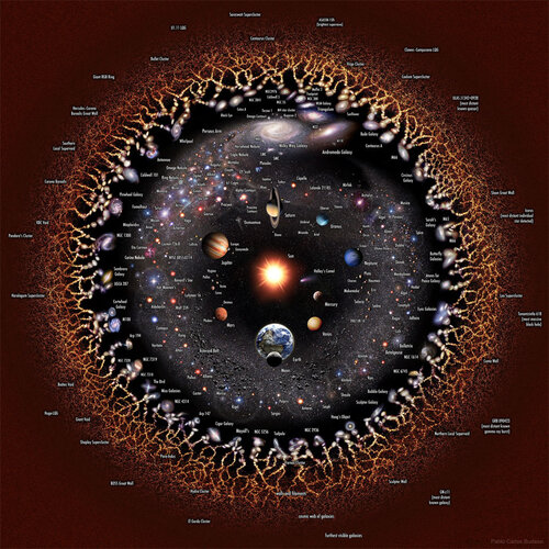
The universe is massive, and Earth is located a long way away from the edge of our known universe. Putting that into a scale is difficult and doesn’t properly showcase just how big the universe is. However, when you start looking at a logarithmic view of the universe, it becomes easier to tell just how massive our universe is, and just how little we know about everything.
The map in question was created by Pablo Carlos Budassi. He shared an original version of the map back in 2012. However, he has updated his logarithmic view of the universe consistently over the years. In fact, it was recently highlighted as the Astronomy Photo of the Day, because it provides such a beautiful view of the universe and everything we know about it thus far.
Looking at a logarithmic view of the universe provides a perspective that a linear map just doesn’t offer. For a linear map, we’d need to take dozens of Earths to measure out distances. This would ultimately make it impossible to pay attention to the smaller parts of the image, while still appreciating the larger picture at play.
However, with a logarithmic map, we can view the universe from a multiplicative factor of “10”. Using a logarithmic scale, the Sun, Mercury, and Mars are all within the same area. We typically measure the universe in Astronomical Units (AU). One AU is equal to the distance from Earth to our Sun...........
https://www.msn.com/en-us/news/tech...sedgntp&cvid=f3b9004d8941e8acb00831e7f83aceae
