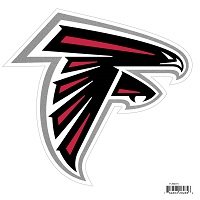
Falcons' new logo gives nazi symbol vibes
The first time I realized it was when they changed the logo I believe back in 2005. I remember seeing a coworker of mine’s computer on NFL.com and it had a page with all the logos on it, very small. I saw it from a distance and I was like “Who the hell is that F team?”
I looked closer, and sure enough, it was the Falcons. A couple of google searches later and I learned that indeed, the Falcons logo is intended to be the letter F.
Once you notice it, you can’t unsee it when watching their games. 😂


