bigdub81
Official SR Logo Designer
Offline
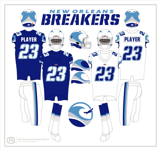
Here's my version of what I like for them. The helmet wave is more horizontal and less vertical in the back. Their wordmark 'BREAKERS' resembles their previous look while still adding curves and sharp edges for style. Their wordmark lettering is also carried into the jersey numbers with a double outline, also reminiscent of their previous look. The wave pattern on both the home and away sleeves are the same for continuity. They also incorporate the full strip pattern rather than just the wave itself. The pants are white instead of silver for both sets. This adds a cleaner look that pairs better with the helmet. The socks are striped to match the pants and break up the solid look from knee to ankle. What do you think?


