
- Moderator
- #1
- Joined
- Aug 8, 1997
- Messages
- 13,744
- Reaction score
- 17,560
- Age
- 58
Online
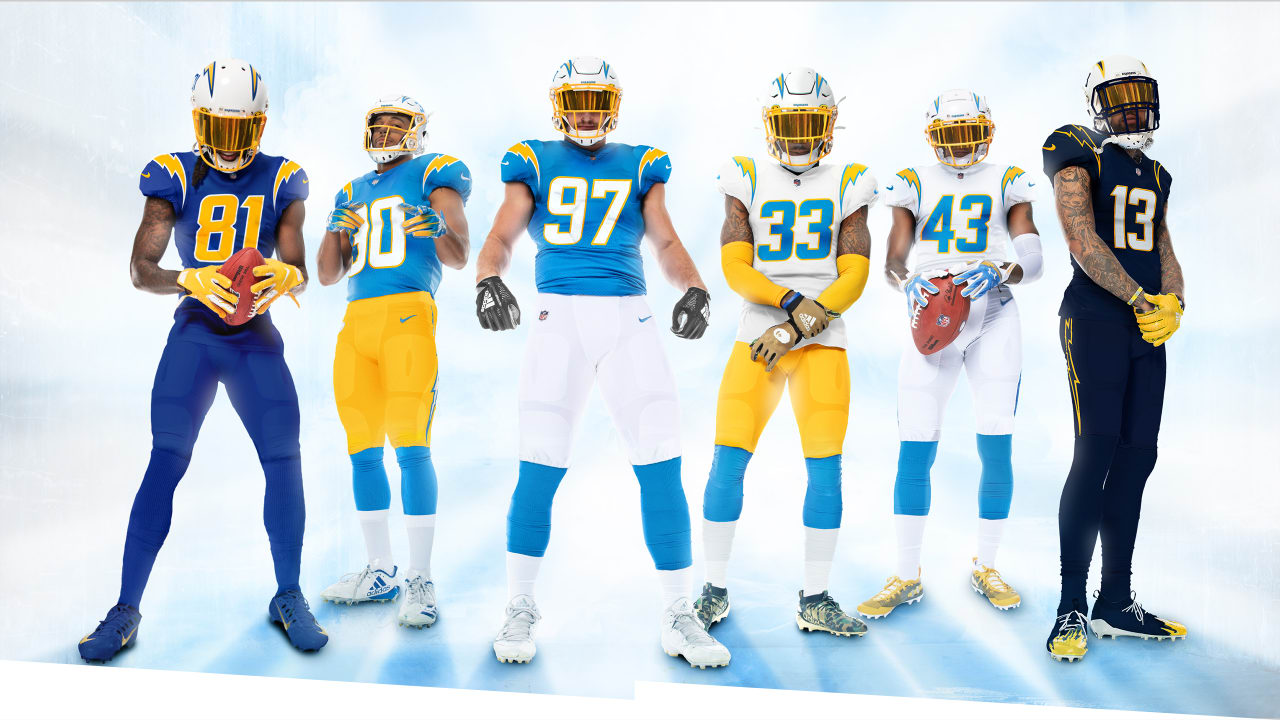
For you fashion reviewers. No contest. Chargers are winners.
 www.chargers.com

Los Angeles Chargers Unveil Much-Anticipated New Uniforms; Minus the Typical Uniform Unveiling Clichés
Words Simply Don’t Do Bolts’ New Uniforms Justice
