bigdub81
Official SR Logo Designer
Offline
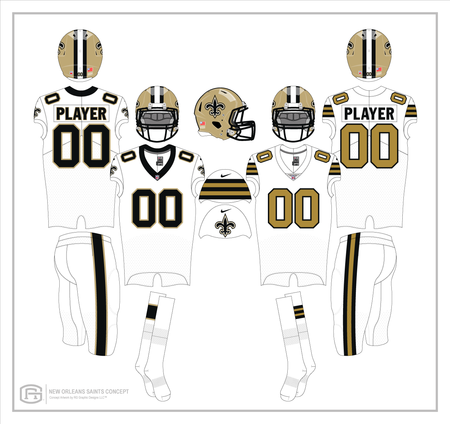
Since the introduction of our white pants, many of you like myself, have stated that they are just a bit too bland without some kind of striping. Here I've added the customary wide black stripe, but this time it has two thin gold stripes on the outsides mimicking the jersey numbers. There is no FDL at the hip on either set and I've added alternate socks to both just see what they would look like.